

- Published on
Introduction to Statistics the Data Scientist Way (Part 1) - Univariate analysis
Introduction
You might hear textbooks or online resources say “Statistics plays a key role in our day-to-day life. It has a wide range of applications in decision-making or drawing inferences in almost everything from data science, machine learning to the stock market”. And this bragging goes on and on. But as learners, we only receive that excitement when we experience it or know the phenomenal things it is actually doing in the world or we ourselves had done using it. That, ladies and gentlemen, is the purpose of this blog, i.e., to grasp the excitement and understanding behind this so-called statistics in a fun, simple, and most importantly, the data scientist way.
Ever-growing data and the necessity to understand it
The story begins with the word “data”. Data comes from many sources: sensor measurements, events, text, images, and videos. Much of this data is unstructured: images are a collection of pixels, with each pixel containing RGB (red, green, blue) color information. Texts are sequences of words and nonword characters, often organized by sections, subsections, and so on. Clickstreams are sequences of actions by a user interacting with an app or a web page. So, a major challenge of data science is to harness this torrent of raw data into actionable information.
Let’s explore more! Google and Facebook rely on data to enhance user experiences, with Google leveraging data to improve search results and Facebook using it to optimize news feed suggestions. Tesla utilizes its data to monitor and enhance its production line performance. Amazon harnesses data to understand customer behavior, personalize recommendations, and manage inventory effectively. Netflix uses data analysis to personalize content recommendations and improve its streaming platform. Uber optimizes its transportation services by analyzing data on drivers, riders, and trip details. Airbnb leverages data to match guests with suitable accommodations and optimize pricing strategies, while Spotify analyzes user listening patterns to curate personalized playlists and enhance user engagement.
So, in general, what companies do is they give or ask their data scientists to collect (usually from databases typically SQL) or look at this data and give them useful insights that help grow the company in whatever sector or area it wants to. And the good news is the story of data doesn’t end there. With machine learning and AI paving their way into literally everyone’s lives, now is the time to generate meaningful data from existing data using machine learning models for companies to make informed decisions and more profit. This should explain why there is and will be an ever-growing demand for data handlers (data scientists) and also one could 100% confidently ascertain that data will only grow and need to draw inferences or build machine learning models to make better decisions never ever fade. This is true no matter what the industry/company type is. They all require people who understand their data and give them better insights. Also, you can personally benefit from the data you generate around yourself like your budget financing or making smart investment decisions based on financial data, or managing your business in a meaningful way (if you have one).
Now, Every step a data scientist undertakes to achieve these goals with their respective data i.e., either drawing inferences or building beautiful graphs, or machine learning models is taught by statistics. And that’s why data scientists need to master statistics. After completing these series of blogs, don’t forget to ask yourself “Isn’t this exciting to see the world dominated by statistics?”.
.

Most Common Form of Data: Rectangular Data
Rectangular data is nothing but Excel sheets, CSV data files, etc… where we have samples along the row and features/predictors/variables along the column. The category of data in a column (a feature) (see Figure 2) can be of any type depicted in Figure 1. It is the most common data that a data analyst or scientist deals with often.
Now, I want you to look at the following picture:

Figure 2: A few rows of the data of population and murder rate by state
The above is the sample dataset that we’re going to deal with throughout this entire blog. For now, I want you to focus on just one column i.e., the Murder rate. With that column, what do you think you can analyze? Basically, you can do either of the following three things
- Estimate the location
- Estimate the variability
- Explore data distribution
Estimate the location (1D focus on a feature)
Measuring location refers to the process of summarizing a dataset by identifying a representative or central value that best represents the entire dataset/feature. The common metrics used in measuring location are the following:
- The mean crime rate is 4.625.
- The trimmed mean (10% cut from either end when the population is arranged in ascending order) is 4.52
- The median crime rate is 5.15
- The weighted mean of the murder rate is 4.445834 w.r.t population (weights).
- The weighted median of the murder rate is 4.4 w.r.t population.
Now, Imagine you’re a newsreader on Television but also turn out to be a data scientist or statistician and you need to say what the average crime rate (cause normal people won’t understand if you say the mean crime rate or median of the crime rate) in US is. What will you choose as your number? There is no certain answer but you have to choose the metric by taking outliers effect into the account as well.
Concept: Outliers
Imagine you're at a party with a group of friends, and everyone's age is being recorded. Most of the people at the party are around 25-30 years old, but there's one person who is 80 years old. In statistics, this person would be considered an outlier. An outlier is like that one person at the party whose age is significantly different from the rest of the group. Using this analogy, we can say that the mean and trimmed mean are sensitive to outliers whereas the median is unaffected by outliers.
Let’s get back to the fundamental question. But why measuring location is useful? You might have heard:
- The average height of a male in India is 5 foot 6 inches
- "Our customer satisfaction rating increased by 20%, showing our commitment to exceptional service."
- "In this neighborhood, the median household income is $70,000, reflecting an affluent community."
- "Based on customer reviews, our product has a 4.5-star rating, a testament to its quality."
All the above numbers in the statements are calculated using the aforementioned metrics (mean, median, etc..) where they sometimes cleverly choose the output that benefits them the most. Overall this summarizes one feature and gives meaningful insights for companies, industries, individuals, etc… to make better decisions.
Estimate the variability ( a 2D focus on a feature)
Measuring variability is a way to understand the spread or dispersion of data points within a dataset. Just as there are different ways to measure location (mean, median, etc.), there are also different ways to measure variability.
- Variance
- Standard Deviation of the population is 6848235
- Mean absolute deviation
- Median absolute deviation from the median (MAD) of the population is 3849870
- Range
- Percentile (IQR of the population is 4847308)
It’s too early to try to make you realize the importance of variability through words. But just remember that at the heart of statistics lies variability: measuring it, reducing it, distinguishing random from real variability, identifying the various sources of real variability, and making decisions in the presence of it. In simple terms, what I’m trying to say is, it's too important to understand variability whose importance you’ll realize as you progress.
Concept: Percentiles
Let’s learn briefly about percentiles since back in the beginning the concept of percentile (other variability measuring metrics are relatively straightforward) bogged me down. Imagine you're in a race with a group of people. The race represents a dataset, and each person's finishing time is a data point. Percentiles are like rankings in this race. For example, the 50th percentile (median) is the middle point where half of the participants finished before and half finished after. If you finished at the 75th percentile (third quartile), you outranked 75% of the participants, while the 25th percentile (first quartile) means you performed better than only a quarter of them.
Percentiles help us compare data points and understand their relative positions within a dataset, just like rankings show where you stand in a race compared to other runners.
Also, IQR is nothing but a difference between the 75th percentile and the 25th percentile.
Points to take note of:
- Variance and standard deviation are the most widespread and routinely reported statistics of variability (Both are sensitive to outliers)
- More robust metrics include mean absolute deviation, median absolute deviation from the median, and percentiles (quantiles).
Exploring the Data Distribution (Exploring how the data is distributed overall rather than looking at a single number)
So far, we’ve looked at boring numbers. Visualizations are the ones that tell a thousand stories about data.
- Box Plots
Box plots are plotted based on percentiles.
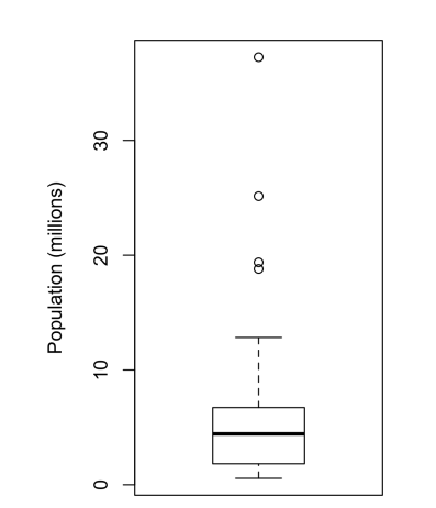
Figure 3: Boxplot of state populations from Figure 1.
- The top and bottom of the box are the 75th and 25th percentiles.
- The median (50th percentile) is shown by the thick horizontal line in the box
- The dashed lines, referred to as whiskers, extend from the top and bottom of the box and represent the range of values within 1.5 times the IQR
- The dots represent outliers
What does it tell you? From this boxplot, we can immediately see that the median state population is about 5 million, half the states fall between about 2 million and about 7 million, and there are some high-population outliers. Overall, we can say it provides a quick overview of a feature. Remember you always analyzing a feature to make decisions.
- Frequency Tables and Histograms
Histograms are plotted using frequency tables. The frequency table here is constructed by creating two more columns: number range and count.

Figure 4: A frequency table of population by state

Figure 5: Histogram of state populations
- Density Plot
A density plot can be thought of as a smoothed histogram, although it is typically computed directly from the data through a kernel density estimate. It provides an estimate of the probability density function (PDF) of the variable. In simpler terms, it shows the relative likelihood of different values occurring in the dataset.
A key difference from the histogram is the scale of the y-axis: a density plot corresponds to plotting the histogram as a proportion rather than counts.

Figure 6: Density of state murder rates
How exactly density plot is plotted? That would take another blog but the simple answer is, Density plots are created by using a kernel density estimation (KDE) algorithm. The KDE algorithm smooths the data by adding a Gaussian kernel (like a probability value as you can see on the y-axis) to each data point. And don’t forget to take note that density plots are useful to know how the overall data points of a feature are distributed.
So far, the columns we’ve dealt with are the Murder rate and population, both are normal and continuous data (see Figure 1). What about categorical data? All the above metrics introduced won’t fit into this. What fits are the following:
- Mode (Ex: In most parts of the United States, the mode for religious preferences would be Christian.)
- Expected Value
- Bar Charts and Pie Charts
We’ll discuss Expected value here since mode, bar, and pie charts are the most common out there to understand easily.
Concept: Expected Value
Let’s understand this concept through an example. A marketer for a new cloud technology, for example, offers two levels of service, one priced at $300/month and another at $50/month. The marketer offers free webinars to generate leads, and the firm figures that 5% of the attendees will sign up for the $300 service, 15% will sign up for the $50 service, and 80% will not sign up for anything. This data can be summed up, for financial purposes, in a single “expected value”, which is a form of weighted mean, in which the weights are probabilities.
In the cloud service example, the expected value of a webinar attendee is thus $22.50 per month, calculated as follows:
EV = (0.05)(300) + (0.15)(50) + (0.80)(0) = 22.5
Now I need you to explore the answer to the question, how those probabilities are calculated in real life?
Importance of Expected Value in real life:
Expected value is a fundamental concept in business valuation and capital budgeting– for example, the expected value of five years of profits from a new acquisition, or the expected cost savings from new patient management software at a clinic.
Overall, focusing on one column is univariate analysis, on two columns it is the bivariate analysis and on multiple it is multivariate analysis. Together, the whole combined is known as Exploratory data analysis. Note that we’re just talking about analyzing not pre-processing, cleaning, or building machine learning models. Thus, we’ve discussed univariate analysis (focusing on just one feature at a time) so far.
Simple Summary
- Data is ever growing and need for data scientists too.
- Structured data is broadly divided into two categories namely: numerical and categorical data.
- Rectangular data is the most common data available in the form of Excel sheets, CSV files, etc.. where columns represent features and rows represent data samples.
- Measuring the location of a single feature use metrics like mean, median, etc.. where the effect of outliers should be considered.
- Measuring the variability of single feature use metrics like variance, standard deviation, etc.. where the effect of outliers should be considered.
- Plot of the data of a feature (bode plot, histogram, and density plot) is important to understand the overall distribution.
- Categorical data uses concepts like mode, expected value, and bar and pie charts for univariate analysis.
So, in conclusion, I need you to come back to this blog whenever you’re looking for or want insights from a single column/feature/predictor to know what you can do. Up next, it is time to look at two or more features at a time and again draw inferences from it to make better decisions.